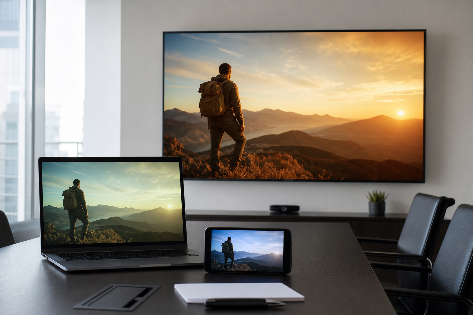
It is a familiar mid-year scene for a business team in Colorado Springs. The spring campaign footage looked sharp in the edit bay, then someone pulls it up on a phone, someone else throws it on the conference room display, and suddenly the same promo feels dull, too warm, too dark, or strangely off-brand. Great footage can still look flat until the finish is built for the screens people actually use.
Color grading makes promotional videos look better on different screens because it balances contrast, color, brightness, and skin tones against a calibrated reference, not a single random monitor. That process helps the same video hold together on phones, laptops, conference room displays, and social platforms, where each screen renders color a little differently.
That is the real value of color grading for promotional videos. It is not just making footage look stylish. It is making sure the quality you approved still feels intentional when your audience sees it first on Instagram, in a sales deck, on a lobby screen, or in a client meeting. At K2Q Factory in Colorado Springs, that calibrated finish is what protects the quality people notice across the work shown at k2qfactory.com.
Why does color grading make promotional videos look better on different screens?
Color grading improves cross-screen viewing because every display interprets image data differently, and grading creates a controlled visual target before export. Without that control, one screen may crush shadows, another may oversaturate reds, and another may cool skin tones enough to make polished footage feel cheap.
Here is the practical problem businesses run into:
- A phone in bright daylight pushes viewers toward higher perceived contrast.
- A conference room screen often runs overly bright with factory settings.
- Social platforms may recompress video and shift subtle gradients.
- Older laptops can mute shadow detail and flatten midtones.
I have seen teams blame the camera, the editor, or even the location, when the real issue was the finishing environment. Most flat-looking promos are not captured badly. They are finished without a reliable visual reference.
A calibrated grade does three jobs at once:
- It sets consistent exposure and contrast.
- It keeps skin tones believable across screens.
- It protects brand colors so they do not drift from one device to the next.
"If the red in your logo turns orange on a phone and brown on the boardroom screen, viewers do not say 'compression issue.' They just feel that something is off." , Framed Event
What actually changes from screen to screen?
Brightness, white point, gamma, gamut, and tone mapping change the way the same file appears. That means the file is constant, but the viewing experience is not.
A simple comparison makes the point clearer:
| Viewing screen | Common rendering issue | What the audience notices |
|---|---|---|
| Modern phone | High contrast, punchy saturation | Blacks look heavier, reds feel louder |
| Conference room display | Over-bright showroom settings | Faces look washed out, highlights feel harsh |
| Standard office laptop | Narrower color and weaker shadow detail | Footage feels gray and less dimensional |
| Social app playback | Compression and platform re-encoding | Gradients band, detail softens, color shifts slightly |
According to Statista, mobile devices account for well over half of global web traffic. That matters because many promotional videos are judged first on a handheld screen, not on the editor's monitor. If your finish only looks right in one environment, it is not finished yet.
How does calibrated grading protect the look of a promotional video?
Calibrated grading protects a video's look by giving the colorist a known baseline for brightness, color temperature, gamma, and gamut. Instead of guessing from a monitor that may be too cool or too bright, the grade is made against a display that is measured and repeatable.
This is where color grading for promotional videos stops being a nice extra and becomes quality control. A calibrated display does not guarantee identical playback everywhere, because screens vary too much for that. It does make the differences manageable, predictable, and far less destructive.
Practical display calibration criteria to ask about
- Target white point, commonly D65 for video work
- Gamma target, often 2.4 for standard video viewing
- Measured brightness, often around 100 to 120 nits for SDR grading environments
- Color gamut coverage, such as Rec.709 for standard delivery
- Routine recalibration schedule, often every 2 to 6 weeks depending on use
- Controlled room lighting so the screen is not judged in a bright, shifting environment
Those numbers are not decoration. They are the difference between a blue-gray "neutral" and a true neutral. The Society of Motion Picture and Television Engineers and the International Color Consortium both exist because display standards matter. Your audience may never say the words Rec.709 or D65, but they absolutely notice when a polished campaign looks muddy or inconsistent.
Colorado Springs brings its own viewing realities. A lot of local teams review work in bright offices with mountain light pouring through windows, then publish to audiences watching outside, in cars, at gyms, or between meetings on a phone. That jump from controlled edit suite to high-glare real life is exactly why calibrated finishing matters here.
Can one grade really work for phones, conference room displays, and social platforms?
Yes, one main grade can work well across all three, as long as it is built from a calibrated master and checked on multiple real devices. The goal is consistency, not a fantasy where every screen looks identical.
A professional process usually looks like this:
- Correct exposure and white balance shot by shot.
- Normalize contrast for the intended delivery format.
- Balance skin tones and neutrals.
- Protect brand-critical colors.
- Review the near-final export on at least 3 to 5 different displays.
- Make small compensation decisions only if the master still holds up.
The weaker version is grading on one uncalibrated monitor and exporting immediately. The stronger version is grading to a reference, then checking how the same scene behaves on a phone, laptop, and presentation display before sign-off. That is how the strongest portfolio work keeps its shape outside the studio.
Myth: If the footage was shot on an expensive camera, it should already look great everywhere.
Reality: Camera quality gives you more image information to work with. It does not solve screen inconsistency, platform compression, or unbalanced contrast. Premium footage without careful grading can still look flat, noisy in the shadows, or off-brand on common displays.
How do you keep brand colors accurate in promotional video?
Brand color accuracy comes from managing the full chain, capture, grading, monitoring, and export, so the key colors stay recognizable even when screens vary. You will never force every display to match perfectly, but you can stop major shifts that make a brand feel inconsistent.
This matters more than many teams expect. A promo video is often the first moving-image impression a customer gets from your company. If your signature navy turns purple on one screen and gray on another, the viewer may not identify the technical issue, but they will feel the mismatch.
For business and brand work, I recommend checking these points:
- Reference swatches: Provide HEX, RGB, CMYK, or Pantone equivalents for brand-critical colors.
- Logo placement: Review logos against both light and dark scenes to prevent color contamination.
- Wardrobe and set design: Avoid letting practical lighting push brand colors too warm or too green.
- Skin tone priority: Brand colors matter, but human faces still need to look believable first.
- Cross-device review: Test the final file on at least 3 common screens used by your team and audience.
Apple's display guidance at Apple Developer and Google's platform guidance at Google Support both reflect a reality editors already know. Devices and platforms interpret media differently. Strong finishing reduces drift by controlling the source as carefully as possible.
That is one reason portfolio work can feel so much more dependable than random in-house edits. It is not just taste. It is process. If you want a useful related read on keeping brand experience consistent across audience touchpoints, K2Q Factory's piece on shared summer campaigns without losing your own brand connects well to this same decision.
What should a business provide before grading starts?
Provide brand standards, intended platforms, sample screens your team uses, and a list of what matters most in the frame. Good grading gets faster and more accurate when the target is clear up front.
Here is what helps most:
- Your logo and brand color references.
- The planned delivery list, such as Instagram Reels, website hero video, YouTube, lobby display, and sales presentations.
- Any previous campaign asset your team liked or disliked.
- A note about where the video will be reviewed internally first.
- Approval decision-makers, ideally 1 to 3 people, not 12.
Most businesses do not need more footage. They need clearer finishing targets.
What export choices affect whether a graded promo still looks good after upload?
Export choices affect quality because the wrong codec, bitrate, color space tag, or aspect ratio can undo careful grading once a file is uploaded or played back on another device. The finish is only as strong as the delivery settings that carry it to the audience.
This is the part buyers often do not see in a proposal, but it is part of what you are paying for. With color grading for promotional videos, the fee should cover more than a prettier timeline. It should include a usable master and delivery versions matched to where the video will actually live.
Common mistake: approving the grade from the edit timeline only
A timeline preview is not the same thing as a final encoded file on a real device. Smart teams review exported files, not just the editing software image, because platform compression and color tags can change the result.
Export considerations worth asking about:
- Master format: Keep a high-quality archival master before platform compression.
- Delivery color space: Standard SDR Rec.709 is still the safest default for broad business use.
- Bitrate: Too low and gradients break apart. Too high and platforms recompress anyway. There is a practical middle ground.
- Aspect ratios: 16:9, 1:1, and 9:16 often need separate framing checks, not just auto-crops.
- Caption burn-ins or graphic overlays: These should be checked after export so colors and contrast still read well.
For many businesses, results show immediately, not in months. The first time your team watches the exported file on 4 devices and stops arguing about why it looks different, you can see the benefit. If you also care about how people engage with the final asset, this pairs well with K2Q Factory's article on the metrics that show whether visual marketing was worth the investment.
Framed Event's Insights
I love beautiful camera work, but I never confuse beautiful raw footage with finished footage. Those are two different things. The moments that stick with people, a glance to camera, a jersey catching light just right, a founder speaking with real conviction, can fall apart fast if the grade is built on a screen nobody trusts.
Here is my rule. If a business plans to show the video on more than one kind of screen, the finish has to be checked on more than one kind of screen. Simple. That is especially true for Colorado Springs brands because so much viewing happens on the move. Phones in bright sun, office TVs, gym displays, sponsor decks, social reposts. A calibrated grade gives those moments a fighting chance to feel the way they felt in real life.
How can you tell if color grading was worth paying for?
You can tell grading was worth it if the finished video stays consistent across devices, brand colors stay recognizable, skin tones look natural, and approval cycles get shorter because fewer people are reacting to screen problems. Good grading removes avoidable friction from launch.
That value can be measured in practical ways:
- Fewer revision rounds caused by "it looks different on my screen"
- Cleaner internal approvals within 24 to 72 hours
- More consistent brand presentation across web, social, and in-room playback
- Higher confidence when repurposing one shoot into multiple deliverables
If your team is reviewing mid-year assets before new production starts, this is exactly the time to check whether past videos held up across screens or only looked good in the edit. K2Q Factory's perspective on when mobile-first experiences help and when they get in the way is useful here too, because screen behavior should shape creative decisions earlier than most brands think.
Need the grading handled before your next campaign goes live?
If you want your footage checked, calibrated, graded, and exported for the screens your audience actually uses, K2Q Factory can take that task off your plate. See the work, then reach out from the portfolio. Turn big moments into unforgettable visuals
View the portfolio at k2qfactory.com