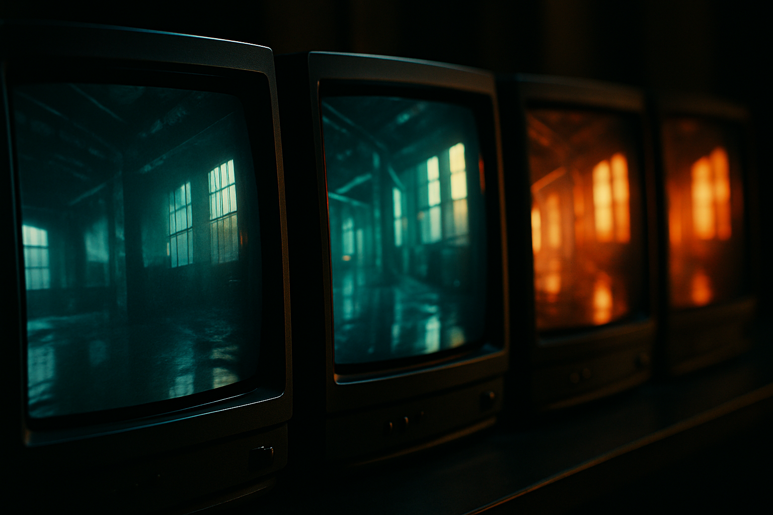
You can spot some brands before you ever see the logo. A cool steel-blue automotive spot, a soft airy wellness reel, a rich amber luxury hotel film. The mark may not appear until the final second, but the feeling shows up immediately. That is the real power of brand color grading. It teaches people what your brand looks like in motion, across months and years, not just in one campaign.
How can color grading strengthen brand identity? Color grading strengthens brand identity by making footage feel consistently recognizable before any text, logo, or product shot appears. A defined grading direction helps every video, photo set, commercial, and social cut share the same visual language, so audiences start associating a specific mood, contrast level, and color balance with the brand itself.
If you are building a long-term content library, this matters more than most teams expect. I have seen brands spend real money on production, then lose recognition because each shoot gets treated differently in post. The footage may look good by itself, but it does not look like it belongs to the same company. Most businesses do not have a footage problem, they have a consistency problem.
How can color grading strengthen brand identity?
Color grading strengthens brand identity by turning repeated visual choices into memory cues. Over time, the audience begins to recognize your contrast, warmth, saturation, skin tone treatment, and highlight behavior the same way they recognize a typeface or package design.
That is why brand color grading is not just a finishing pass. It is identity work. In video, color often arrives before the viewer processes copy or composition. The eye reads temperature, density, and palette instantly. According to Colorcom, people make a subconscious judgment about a product within 90 seconds, and up to 90% of that assessment can be based on color alone. The exact percentage varies by context, but the takeaway is clear. Color is doing recognition work early.
In practice, that means a brand can become familiar through patterns like these:
- Warmer mids and softer contrast that feel welcoming and human
- Cooler shadows and cleaner whites that signal precision
- Muted saturation that suggests restraint and premium positioning
- Bold, high-energy primaries that feel athletic or youth-focused
- Golden skin tones and richer blacks that create a cinematic, aspirational look
A logo confirms identity. The grade often introduces it.
What makes one visual style recognizable across an entire industry?
Recognizable styles come from repeated category signals. Industries tend to reward certain color behaviors because they match buyer expectations, and brands that understand those expectations can stand out without looking out of place.
Look across a few industries and the patterns are easy to see.
| Industry | Common grading direction | What the audience reads from it |
|---|---|---|
| Fitness and sports | High contrast, crisp whites, bold color separation, cooler shadows | Speed, intensity, discipline |
| Luxury hospitality | Warm highlights, rich ambers, controlled blacks, softer rolloff | Comfort, exclusivity, atmosphere |
| Healthcare and wellness | Bright neutrals, gentle contrast, clean skin tones, restrained saturation | Clarity, calm, trust |
| Outdoor brands | Natural greens, earth tones, open dynamic range, real sky detail | Authenticity, durability, place |
| Tech and SaaS | Cooler palette, polished neutrals, selective pops of brand color | Precision, innovation, control |
These are not rules you must obey. They are audience habits you should understand. A law firm probably should not grade like an action sports brand. A boutique gym probably should not look like a pediatric clinic.
Here is the difference between weak and strong direction.
- Weaker: Every shoot gets graded by mood that week. One video is orange and dramatic. The next is cold and glossy. The next is flat and neutral.
- Stronger: Every shoot adapts to the location and lighting, but lands inside the same visual family. Skin tones remain consistent. Contrast stays within a narrow range. Brand colors never drift.
The second approach is what builds memory. If you want a useful reference point for how finishing decisions affect perceived quality, K2Q Factory breaks down why great footage still looks flat until color grading matches the viewing screen. It is a practical reminder that consistency is technical as much as it is aesthetic.
How do you choose a grading direction that fits your brand without fighting your industry?
The right grading direction sits where three things overlap. It should respect industry expectations, reflect your existing brand standards, and hold up across a long content library that may include interviews, product footage, lifestyle clips, drone shots, and still photography.
That selection process should be specific. Here is the framework I would use with a business in Colorado Springs.
- Start with category expectations. List the 3 to 5 visual traits your audience already associates with your industry. For an outdoor brand near Garden of the Gods, natural sky color and believable terrain may matter more than aggressive stylization. For a medical practice, accurate skin and clean whites matter more than dramatic contrast.
- Audit current brand materials. Pull your website, printed collateral, packaging, uniforms, venue signage, and social content. Note recurring hues, not just official hex codes. Real brands often live in a narrower practical palette than their style guide suggests.
- Define non-negotiables. These are usually 4 to 6 controls, such as skin tone warmth, highlight softness, black level depth, saturation limit, and treatment of the primary brand color.
- Test across formats. A grading direction must work on a 15-second vertical clip, a 90-second brand film, a still gallery, and drone footage at noon. If it only looks good in one setting, it is not a system.
- Build a repeatable LUT or reference still set. That gives future editors, shooters, and retouchers something concrete to match.
Colorado Springs creates a special challenge here. We get hard midday sun, bright winter reflection, dry summer tones, and dramatic blue skies that can shift fast with elevation and weather. A grading direction that works in a downtown lifestyle shoot may need guardrails to stay consistent on a windy afternoon near Red Rock Canyon or a snow-bright morning on the north side.
I like brand systems that survive real life. If your visual identity falls apart the moment lighting gets difficult, it was never much of a system.
What you should ask for if you are paying for brand color grading
- A documented grading direction, not just a finished export
- Reference frames or look boards showing the approved palette
- Clarity on how interviews, b-roll, drone footage, and stills will be matched
- A plan for keeping brand colors stable across different cameras and seasons
- Defined deliverables, such as final masters, social versions, LUTs, or reference presets
- A review process with 1 to 2 revision rounds tied to agreed visual standards
How do you know if brand color grading is actually working?
You know it is working when recognition and consistency improve across multiple assets, not when one hero piece looks impressive on its own. The best measurement is comparative and practical.
Here are useful ways to assess performance:
- Cross-asset consistency. Compare 10 pieces produced over 6 to 12 months. Do they feel related without needing a logo?
- Brand color stability. Check whether core colors drift from shoot to shoot because of lighting, camera differences, or editing shortcuts.
- Stakeholder agreement. Can your internal team describe the look in similar words, or does everyone see something different?
- Library usability. Can older footage cut into newer edits without obvious visual mismatch?
- Audience recall. In client review or small feedback sessions, do viewers describe the footage in the same emotional terms you intended?
This is one reason process matters. According to Nielsen, creative quality is a major driver of advertising performance. That does not reduce identity to one metric, but it reinforces a truth people in production see every week. Visual consistency changes how work is received.
What will you actually get for the fee if this is done well? Usually some combination of these:
- Color-corrected and graded finals
- Scene matching across cameras
- Brand look references for future shoots
- Deliverables optimized for web, social, presentation, or broadcast use
- A repeatable finishing standard that shortens future review cycles
How long until results show? Recognition gains start immediately inside your own content library. External audience recognition takes longer, often after 8, 12, or 20 pieces begin carrying the same treatment. Identity is repetition.
Framed Event's Insights
I love the moment before a crowd roars or a product reveal lands, that split second when the image tells you what kind of story you are stepping into. Color does that job fast. It sets the pulse. It tells you if this is grit, luxury, calm, or speed.
What I see too often is a business approving footage one project at a time without protecting the long game. Six months later, the library feels scattered. One edit is moody, one is washed out, one is hyper-saturated. All of them may be good. None of them belong together. That is expensive.
If I am helping shape a visual identity, I want to know what the brand should feel like in January, in July, indoors, outdoors, at sunset, and under ugly overhead lighting. If the look cannot survive those conditions, it is not ready for real use.
What should a Colorado Springs business prepare before hiring for brand color grading?
Bring reference, priorities, and a realistic scope. Good grading gets better faster when the creative team can see your existing standards, your future content needs, and the environments where your footage will actually be captured.
At minimum, prepare these 5 inputs:
- Brand guidelines, even if they are incomplete
- Examples of past content you like and dislike
- Your main deliverable types, such as ads, social clips, athlete reels, product promos, or event recaps
- The platforms and screens that matter most
- A rough production timeline, including seasonal needs
For local businesses, seasons matter. Summer footage in Colorado Springs carries different color challenges than winter content, especially with dry grass, storm light, altitude haze, and snow reflection. If your brand will shoot year-round, your grade needs range. This connects directly with long-term storytelling, which is why pieces like why summer customer stories outperform generic seasonal promotions in Colorado Springs matter. The point is not the season. The point is continuity.
If your content mix includes commercial spots, athlete features, venue coverage, and aerial footage, ask how those will be matched. Drone work especially can expose inconsistency fast because sky, landscape, and contrast behavior shift dramatically from shot to shot. K2Q Factory’s portfolio at k2qfactory.com shows how cinematic finishing ties those moving parts together.
I would rather build a look that lasts 3 years than chase 30 different looks in 30 months.
Frequently Asked Questions
Do brand guidelines already cover color grading?
Usually not in enough detail. Most brand guides define logo use, fonts, and graphic colors, but they do not explain how real footage should handle white balance, contrast, skin tones, skies, shadows, or mixed lighting. Brand color grading fills that gap for motion and photo content.
Can a strong grade still feel natural?
Yes. Strong does not mean heavy. Some of the most effective brand looks are subtle. The goal is not to make every frame look stylized. The goal is to make every frame feel like it came from the same visual world.
Is this only useful for large brands with huge content budgets?
No. Smaller businesses often benefit faster because inconsistency stands out more when every piece of content has to work hard. Even a library of 8 to 15 polished assets gains value when they share one recognizable look.
Want this visual identity work handled for you?
If your footage looks good but not consistently yours, K2Q Factory can handle the exact task this article covered: defining and applying a long-term brand color grading direction that fits your industry, your standards, and your future content library. View the work, then reach out. Turn big moments into unforgettable visuals
See the portfolio and contact K2Q Factory