A palm tree, a cartoon sun, and a yellow gradient might say "summer," but they do not say your market. A stock photo of a smiling family with a lemonade stand might fill a social post, but it does not tell anyone where you work, what you actually do, or why your business is relevant this month. If you want summer marketing to feel current instead of generic, the visual has to show a real place, a real use case, and a brand people can recognize again next week.
The visuals that work best for summer marketing are locally recognizable, brand-consistent images tied to what customers are actually doing during the season. The strongest AI summer marketing visuals show a real setting, a practical summer need, and your brand structure in a format you can reuse across your website, Google Business Profile, email, and social without looking random.
What types of visuals work best for summer marketing?
The best summer visuals are recognizable, useful, and branded. They work when people can quickly tell the season, the business, and the context without having to decode a generic holiday-style graphic.
For most local service businesses, the strongest summer visuals usually include:
- A real backdrop that fits the market you serve, not a stock beach scene from nowhere
- A current seasonal activity, such as patio traffic, storm prep, irrigation checks, summer scheduling, outdoor events, or home projects
- Clear brand anchors, including your colors, typography, logo treatment, and repeatable layout
- Practical proof, such as a team member on site, a storefront, a service vehicle, or the product being used in a believable setting
That matters because local search behavior is still high-intent behavior. According to Google, people use Search and Maps to find nearby businesses, compare options, and decide where to go next. The image does not do all the selling, but it does help confirm, fast, that your business is active and relevant.
I will say it plainly. Most businesses do not have a design problem. They have a relevance problem. Their summer post looks fine, but it could belong to any company in any city.
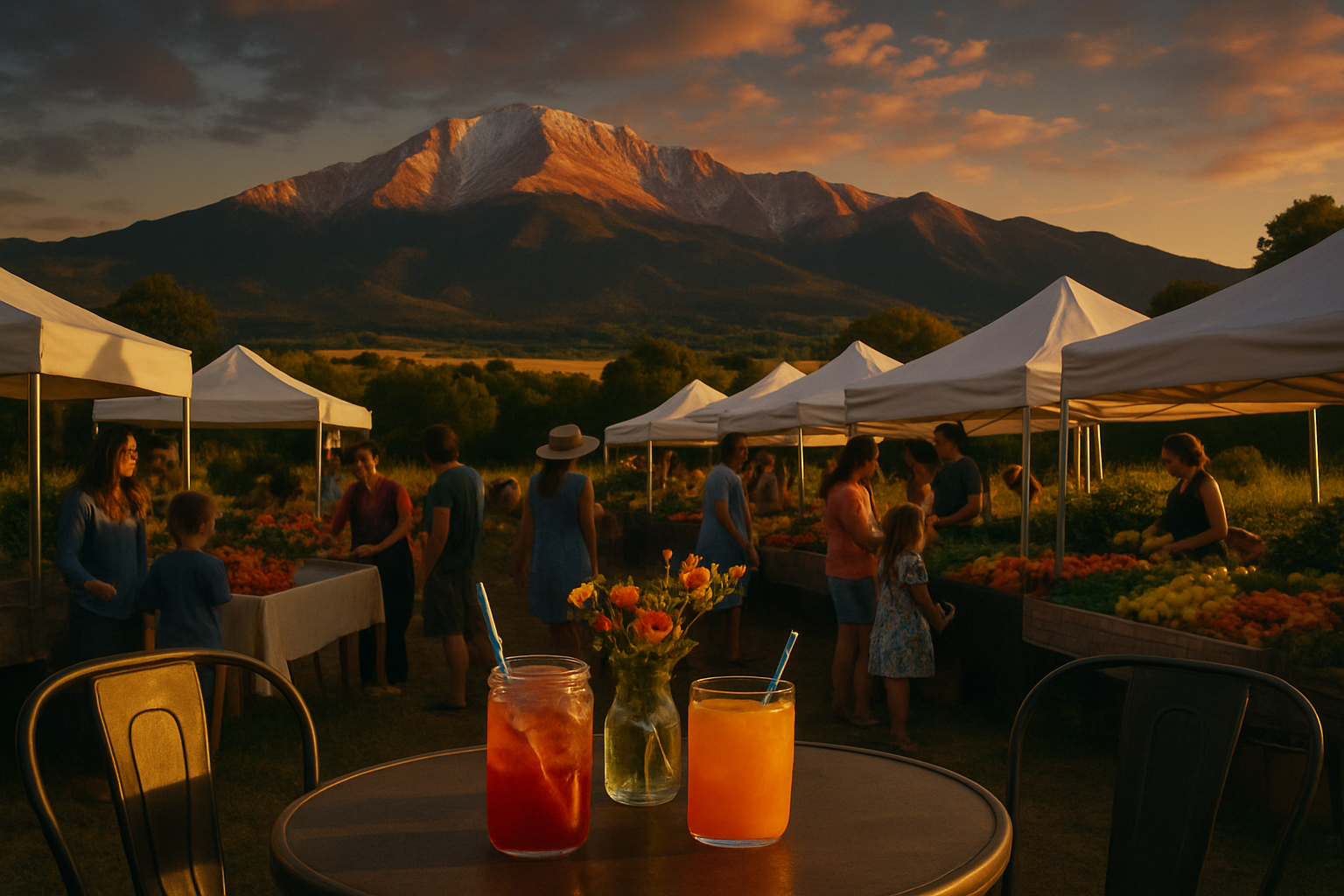
Summer in Colorado Springs has its own look. Dry light, red rock backdrops, busy patios, youth sports, trail traffic, and those afternoon thunderstorm buildups that change a roofer's, landscaper's, or HVAC company's message in a hurry. In July 2025, Colorado Springs Airport reported a record 273,453 passengers for the month, a useful reminder that summer movement here is real, visible, and seasonal. Good visuals should look like they belong in that rhythm, not in a generic vacation template.
Why do locally relevant images beat stock-style summer graphics?
Locally relevant visuals beat stock graphics because they create faster recognition and more credibility. A generic summer image says "seasonal post." A specific local image says "we do this work, in places like yours, right now."
That difference shows up across channels. A plain "Hello Summer" image may get a glance. A branded visual with a service van outside a real neighborhood home, or a restaurant patio with recognizable surroundings, gives the viewer a reason to connect the season to an actual business need.
Here is the weak versus strong version I see all the time:
- Weak: A stock beach chair image with the text "Summer Savings Are Here"
- Strong: A branded image featuring your actual category, a believable local setting, and a headline tied to a timely summer need
Examples by business type:
- HVAC company: Skip the cartoon sun and thermostat icon. Use a technician outside a home, with copy about keeping systems steady during hot afternoon stretches and heavy seasonal demand.
- Restaurant: Skip tropical clip art. Show the patio, signage, and evening light customers already associate with your place.
- Home services company: Skip the overly lush lawn stock photo. Show conditions that match your region, from dry yards to storm cleanup to shade solutions.
- Medical or dental practice: Skip pool-float graphics. Use summer scheduling, family routines, or back-to-school prep imagery that feels practical.
According to HubSpot, visual content remains one of the most commonly used content formats in marketing because it helps attract attention and support engagement. That does not mean any visual will work. It means the right one gets noticed for the right reason.
Which summer scenes make marketing feel current instead of forced?
The best summer scenes are the ones your buyers already associate with weekly life, not postcard filler. Good seasonal imagery supports the offer. It does not distract from it.
Useful inspiration for AI summer marketing visuals includes:
- Patio dining, outdoor waiting areas, storefront foot traffic, and event spillover
- Summer storm clouds, rooflines, gutters, and property maintenance scenes
- Trailheads, parks, sports fields, and family activity settings that fit the audience
- Driveway projects, irrigation checks, shade upgrades, and exterior service calls
- Back-to-school scheduling visuals in late summer for family-focused businesses
The point is not tourism. The point is familiarity. If you are a pediatric dentist, you do not need a dramatic hero shot every week. You need visuals that show your brand in a summer context parents recognize. If you are a landscaper, a realistic yard style beats a glossy image of a lawn nobody in your market actually has.
City of Colorado Springs publishes an active calendar of summer events and community activity across the season. That matters because local movement changes what feels timely in the feed. A smart summer image often works because it matches what people were already out doing that week.
Common mistake
Using local landmarks as decoration instead of context. Putting a mountain or skyline behind every post does not make it local. If the landmark has no connection to the business, message, or customer need, it turns into wallpaper fast.
How do you keep summer visuals aligned with your brand?
The best summer visuals still look like your business first. Seasonal relevance should support brand recognition, not replace it with a different style every two weeks.
This is where a lot of teams get sideways with AI summer marketing visuals. They chase novelty, end up with five different art styles in five weeks, and then wonder why nothing sticks. Recognition is built by repetition with judgment, not by constantly starting over.
What works better is a simple system:
- Keep your core brand colors in every asset
- Use one or two repeatable layout structures
- Stick to the same typography family
- Let seasonal imagery be the variable, not the whole identity
- Match visual tone to the real customer experience you provide
If you are a law office, your June and July visuals should not suddenly look like a vacation resort. If you are a med spa, they can feel lighter and more seasonal without losing the clean, controlled look that built trust in the first place. If you want examples of what a repeatable image system looks like, this article on designing a summer image series that keeps service businesses recognizable is worth your time.
Myth: Summer marketing needs to look completely different from the rest of the year to stand out.
Reality: Summer marketing should look seasonally current while still looking unmistakably like your company. Style drift hurts recognition more often than it helps attention.
My rule is simple. If the image gets attention but weakens brand memory, it is not helping as much as you think.
How can one summer visual work across multiple channels without feeling repetitive?
One strong visual can support several channels if it is designed with clear focal points, flexible crop space, and a message hierarchy that survives resizing. The goal is not to post the exact same file everywhere. The goal is to turn one branded concept into a small campaign set.
That matters because most businesses do not have time to reinvent creative for every platform. A good summer visual can become:
- A website banner tied to a seasonal service page or authority article
- A Google Business Profile post image
- A LinkedIn graphic with a tighter crop and more direct headline
- A Facebook or Instagram post with a local community angle
- An email header for reminders, scheduling pushes, or seasonal offers
That is where AI summer marketing visuals are actually useful. Not as a gimmick. As part of a publishing system that keeps the place, the business, and the message consistent. One strong article each week usually gives those visuals more to do than a pile of disconnected daily posts ever will. I covered that tradeoff more directly in why one strong authority article each week outperforms daily AI posts.
Before reusing one visual across channels, check these five things
- Does the image still read clearly in square, vertical, and banner crops?
- Is the headline short enough to survive channel changes?
- Does the local or practical detail stay visible after cropping?
- Are your logo, colors, and layout treatment consistent in every version?
- Does each version match how people behave on that channel?
Jeff's Insights
I built postedby.ai because I got tired of watching businesses spend real money on marketing that disappeared the second the campaign stopped. Seasonal visuals were part of that mess. Owners would post a generic summer graphic, get a little activity, then do the same thing again next week with a different color and a different headline. That is not a system. It is decoration with a deadline.
What I think works is much less exciting and much more useful. Pick a visual structure your business can repeat. Tie it to a real article, a real customer question, and a real seasonal need. Then let the visual support that answer everywhere it shows up. If the image helps people recognize the business and gives the article a better chance to earn the click, it is doing its job.
"A summer visual should not just say the season. It should say the business, the place, and the reason to pay attention." Jeff
What should local businesses avoid in summer visual campaigns?
The visuals to avoid are the ones that flatten your business into seasonal filler. If it looks interchangeable, overdesigned, or disconnected from what customers are actually dealing with, it is probably working against you.
Avoid these common misses:
- Stock beach imagery that has nothing to do with your market or your service
- Overusing suns, flip-flops, watermelons, and vacation graphics for serious service businesses
- Changing visual style every week based on trends
- Using scenic imagery with no brand structure around it
- Forcing summer themes into messages that should stay practical and service-focused
For many service companies, the best summer campaigns are not flashy. They are current, local, and useful. A pest control company can talk about seasonal activity. A roofer can tie visuals to storm season. A family practice can shift from summer scheduling to back-to-school reminders. If that late-summer handoff matters to your business, this guide on building a back-to-school campaign around one buyer decision connects well with the visual side of the job.
That is why AI summer marketing visuals should be treated like working assets, not novelty pieces. They should help a useful article travel farther, support Google Business Profile updates, and give your audience a consistent cue that the business behind the post is real. If you are building the system behind that consistency, your Champion setup inside postedby.ai is where the brand memory part gets easier.
Frequently Asked Questions
What types of visuals work best for summer marketing?
Locally relevant, brand-consistent visuals work best. The strongest options show a real place, a real seasonal use case, and a layout that still looks like your business.
Are stock summer images ever okay?
They can work as filler, but they usually underperform compared with visuals tied to your market, service, and brand. If the image could belong to any company in any city, it is weaker for recognition.
How often should summer visuals change?
Change the message more often than the style. Keep the visual system stable, then rotate scenes, headlines, offers, and use cases throughout the season.
Can one summer visual be used for both social and website content?
Yes. If it is designed with flexible cropping, clean hierarchy, and visible brand anchors, one concept can support an article header, Google Business Profile post, email header, and social graphic.
Do AI summer marketing visuals replace brand photography?
No. They work best when they support real branding, fill publishing gaps, and keep your seasonal campaigns consistent. They should not replace the real identity of the business.
Build summer visuals that support real authority, not generic filler
If your seasonal graphics look current for a day and forgettable by next week, the fix is not more decoration. It is a branded system that ties AI summer marketing visuals to useful articles, Google Business Profile posts, social content, and follow-up across channels. That is exactly what postedby.ai is built to do. Be the source AI cites.
Start free with the Starter plan at postedby.ai