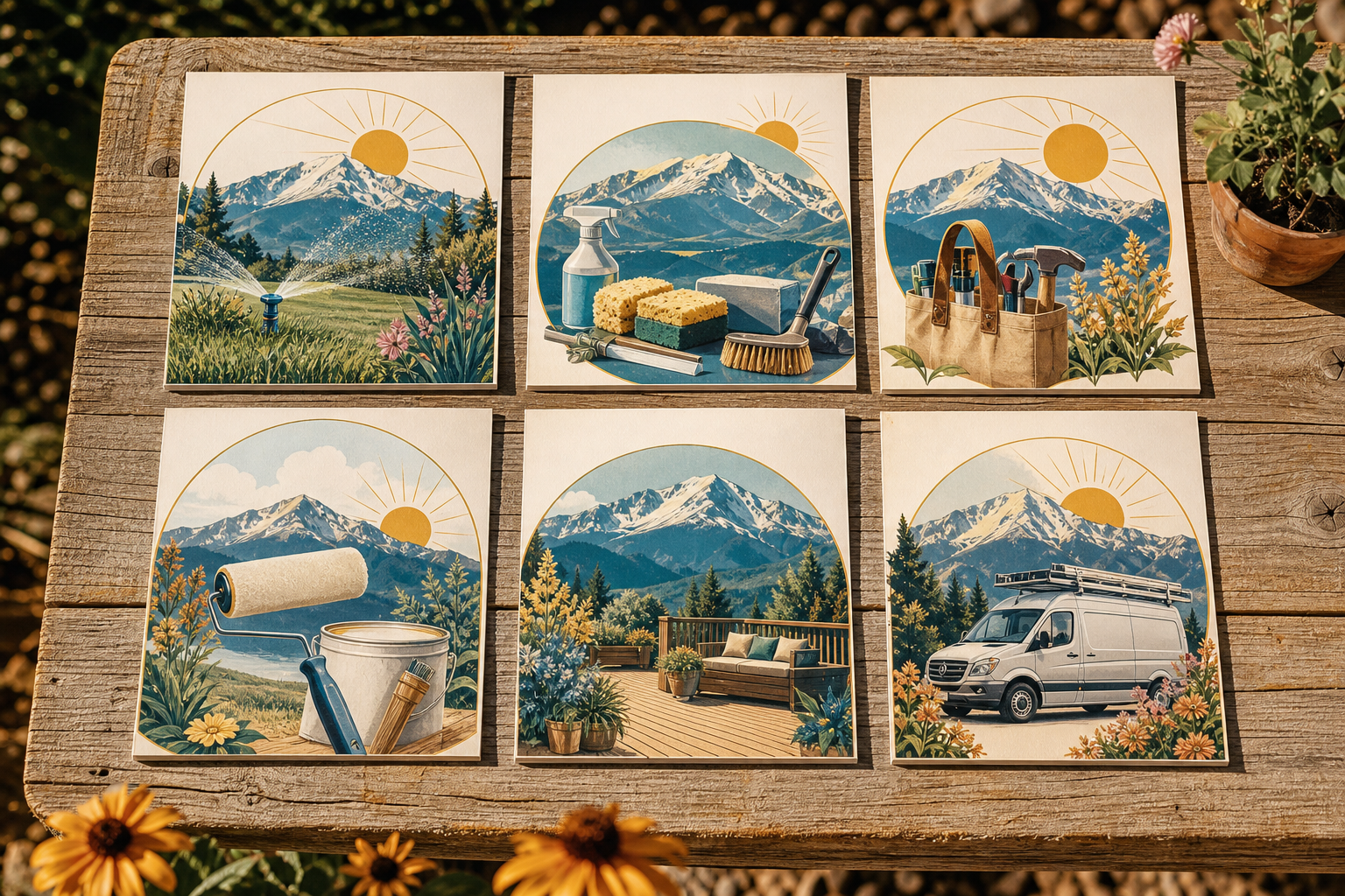
Scroll through a lot of local business feeds in June and July and you will see the same mistake. The offer changes, the photo style changes, the colors change, the fonts change, and by post number four the business is basically unrecognizable. A summer campaign should make you easier to spot, not harder. If you want people in Colorado Springs to remember your business across Google Business Profile posts, Facebook updates, LinkedIn, and website articles, the answer is not more visual variety. It is a repeatable branded AI image series that looks like it came from one business every single time.
Consistent visuals improve summer marketing by making each post instantly recognizable, easier to trust, and more likely to reinforce memory over time. A repeatable visual system, using the same colors, layouts, and local cues, helps service businesses stay familiar across search, social, and AI-driven discovery instead of looking random from post to post.
How can consistent visuals improve summer marketing?
Consistent visuals improve summer marketing because repetition builds recognition faster than novelty does. If every summer post shares the same visual structure, your audience does not have to relearn who you are each time. They spot you, connect the message to your business, and keep moving toward a call or visit.
That matters even more for service businesses. A roofing company, med spa, HVAC company, law office, home services brand, or local clinic in Colorado Springs usually wins by being remembered at the right moment. Not by making the most dramatic graphic of the week.
Recognition is a system problem, not a creativity problem. The system usually includes:
- One core color palette
- Two dependable font treatments
- One or two recurring layouts
- A repeating image style
- Local references that make the posts feel rooted in place
According to Lucidpress, consistent brand presentation can increase revenue by up to 33 percent. That stat gets quoted a lot because the principle is simple. Familiar brands get remembered. Remembered brands get chosen. Source: Lucidpress, cited widely in brand consistency research.
I will put it plainly. Most businesses do not have a design problem, they have a consistency problem.
What should a simple summer visual system include?
A workable summer visual system should be small enough to repeat without debate. Pick a few fixed ingredients and keep using them. That is how a branded AI image series stays recognizable instead of drifting into random styles every week.
Here is the simple version I would use for a full summer campaign.
1. Lock the color consistency
- Choose 2 brand colors you already use
- Add 1 seasonal accent color for summer only
- Use the same background treatment across every image
Example for a Colorado Springs service business:
- Primary navy or charcoal from the existing brand
- Secondary white or warm sand
- Summer accent in muted sky blue or sunset orange
Do not swap to neon gradients just because they are popular this month. Summer does not mean your brand has to start shouting.
2. Pick recurring layouts
Use the same 3 layouts on repeat for the whole campaign:
- Tip Post Layout. Big headline top left, supporting image right, small logo footer
- Offer Post Layout. Offer badge top, service image center, call to action bar bottom
- Local Reference Layout. Short seasonal headline over a Colorado Springs background, branded text card overlay
3. Define one image style
Choose one visual direction and keep it all summer:
- Clean photo-real style
- Soft branded illustration
- Text-led graphics with supporting imagery
What you do not want is one post that looks like a stock ad, the next that looks like a comic book, and the next generated from a random AI fantasy prompt. That is not creative range. That is identity drift.
How do you build a branded AI image series for an entire summer campaign?
A branded AI image series works best when it follows a campaign sequence, not one-off prompts. Plan the whole summer as a connected set of image types so every post looks related, even when the message changes week to week.
Here is a practical 12-week summer sequence for a service business.
June, awareness and seasonal relevance
- Week 1: Summer kickoff image with seasonal headline and core service
- Week 2: Educational tip graphic about a common summer issue
- Week 3: Team or owner authority post with branded quote layout
- Week 4: Local post tied to Colorado Springs weather, events, or neighborhoods
July, trust and proof
- Week 5: Before and after or problem and solution format
- Week 6: FAQ visual with one clear answer
- Week 7: Limited seasonal offer in the offer layout
- Week 8: Customer story or testimonial card in the same frame style
August, urgency and booking
- Week 9: End-of-summer reminder tied to service timing
- Week 10: Booking prompt with simple checklist visual
- Week 11: Local authority post, "What Colorado Springs customers ask us every August"
- Week 12: Campaign wrap-up image with clear next action
The message changes. The system does not. That is the point.
A stronger campaign also ties each image to a matching authority post, short social caption, and local discovery update. That is how recurring authority publishing works in real life. The article carries the detail, and the visual carries the recognition.
The common mistake
Businesses often treat AI image creation like a slot machine. They enter a new prompt every week, get a different art style every week, and call it content. That creates more images, but less memory. The better move is one repeatable branded AI image series with controlled prompts, fixed layouts, and a visual standard the whole team can follow.
How should Colorado Springs businesses adapt the series locally?
Colorado Springs businesses should adapt a summer image series with real local references, not generic mountain clichés. Local detail helps people feel that the content belongs here, and it gives your visuals more relevance in local discovery without changing your brand system.
Here are a few ways to do that without turning every post into a postcard.
- Use subtle Front Range backdrops, not dramatic travel-poster scenery
- Reference real summer conditions, afternoon sun, dry heat, hail season, wildfire smoke concerns, busy moving months
- Mention neighborhoods or service areas where relevant, such as Briargate, Falcon, Security-Widefield, Powers Corridor, or Old Colorado City
- Tie service timing to local behavior in El Paso County
Colorado Springs summer marketing should reflect actual local rhythm. Families travel in June, storm concerns spike with summer weather, and many homeowners wait until late July or August to handle projects they should have booked earlier. A recurring visual series can mirror that timing while still looking like one brand from Northgate to Fountain.
Weak local example:
- "Summer savings are here" over a generic tropical background
Stronger local example:
- "Beat late-summer booking delays in Colorado Springs" in your standard offer layout, with a subtle Pikes Peak-adjacent skyline treatment and your locked summer accent color
That second one still follows the brand. It just belongs to a real place.
Why should service businesses avoid viral design trends and random AI prompts?
Service businesses should avoid viral design trends and random AI prompts because trend-chasing usually trades recognition for novelty. A post may look current for a week, but if it no longer looks like your business, it weakens the campaign instead of strengthening it.
Nielsen Norman Group has long documented the value of consistency in user experience because familiar patterns reduce cognitive load. The same principle applies here. If your audience has to decode your style every time, they spend attention on the design instead of the message. Source: Nielsen Norman Group.
Myth: More visual variety keeps the audience interested.
Reality: For local service brands, too much visual variety usually makes the business harder to recognize. Interest matters, but recognition comes first. The best campaigns repeat the same system while changing the message inside it.
I am pretty contrarian on this one. Most local businesses do not need trendier content. They need content that looks like it came from the same business six times in a row.
"If your image style changes every week, your authority resets every week." Jeff
Jeff's Insights
I built postedby.ai after watching too many good businesses disappear between campaigns. They would run ads, get busy, stop posting, and then go quiet again. Or worse, they would keep posting but every update looked like it came from a different company. That is not a publishing engine. That is noise.
If I were setting up a summer campaign for a Colorado Springs service business today, I would rather have twelve useful posts in one recognizable system than twelve clever experiments. The business should become easier to spot each week. That is how you build authority without babysitting content full time. You do not need a different visual identity for every idea. You need one identity that can carry a lot of ideas.
What does a good branded image workflow look like across channels?
A good workflow uses one core visual system across articles, social posts, Google Business Profile updates, and outreach content. The visuals should match the publishing cadence so your authority compounds instead of fragmenting.
Here is the workflow I recommend:
- Start with one weekly authority topic
- Create the main article first
- Pull 2 to 4 social angles from that article
- Generate images from one approved campaign template set
- Publish the same visual language across channels
- Track which topics and image types get traction
That is where a branded AI image series helps most. It connects recurring authority publishing to a recognizable visual identity, which is exactly what busy owners usually do not have time to manage by hand.
Checklist for a summer image series that stays recognizable
- One fixed summer palette
- Three repeatable layouts
- One image style for the full campaign
- Local Colorado Springs references used lightly and consistently
- Matching article, social, and local post topics
- No random trend shifts midway through the season
- Simple review process so every image meets the same brand rules
Frequently Asked Questions
How many image templates should a summer campaign use?
Three is enough for most service businesses. One for educational posts, one for offers, and one for local or authority posts. That gives you variation without losing recognition.
Can AI-generated images still feel branded?
Yes, if the prompts and layouts are controlled. AI is not the problem. Randomness is the problem. A branded AI image series works when you define color, composition, typography, and subject style before the campaign starts.
Should every post include Colorado Springs references?
No. Use local references where they add relevance. A neighborhood mention, seasonal weather cue, or regional backdrop every few posts is enough. Too much local dressing starts to feel forced.
What is better for summer, photos or graphics?
Either can work. The better choice is the one you can repeat consistently for twelve weeks. For most local service businesses, a mix of branded text graphics and controlled photo-style AI visuals is practical and easier to keep on brand.
How often should a service business post during summer?
Weekly is a strong baseline for authority building. If you can support more, add one or two social variations from the same core topic and image system rather than inventing entirely new campaigns.
Create a summer campaign people can actually recognize
If your summer marketing keeps changing styles, your audience has to keep relearning who you are. We help local businesses build recurring authority publishing with matching visuals, including a branded AI image series that stays consistent across articles, social posts, Google Business Profile updates, and local discovery. Start a free Starter plan at postedby.ai and build your Champion voice. Be the source AI cites.
Start your free Starter planExplore more, or reach out directly to postedby.ai in Colorado Springs, CO.